Brief Examples
artpack can be used to create specified dataframes that will map art
when fed into ggplot2 functions:
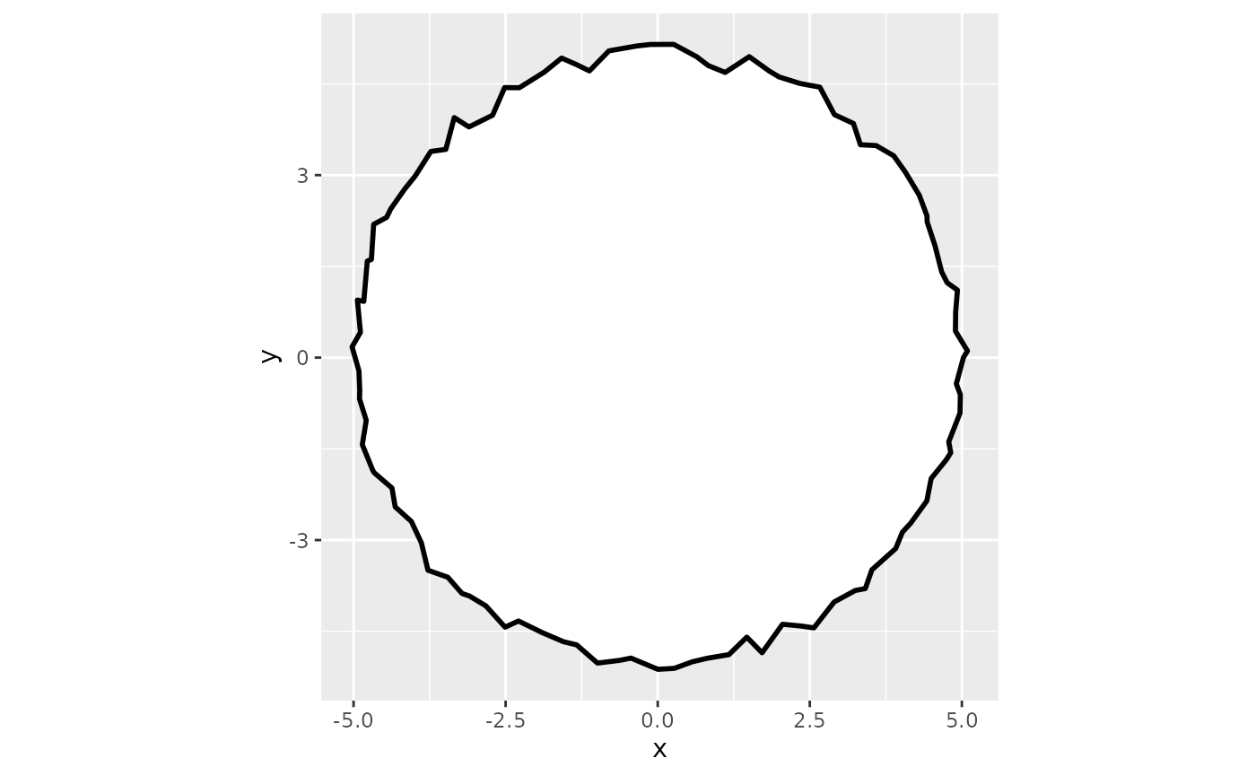
For example, circle_data() creates a data frame that
maps a circle on to a ggplot:
#| fig.alt: >
#|   ggplot plot showing a black outlined circle with
#|   irregular, slightly wavy edges centered at the origin
#|   of a coordinate grid, with x and y axes ranging from
#|   approximately -5 to 5, set against a light gray background,
#|   the default ggplot2 plot theme.

# Load your libraries#
library(ggplot2)
library(artpack)

# Use the function to create a data frame#
df_circle <-
  circle_data(
    x = 0,
    y = 0,
    radius = 5,
    color = "black",
    fill = "white"
  )

# Feed it into a ggplot#
df_circle |>
  ggplot(aes(x = x, y = y)) +
  geom_polygon(
    fill = df_circle$fill,
    color = df_circle$color,
    linewidth = 1,
    position = position_jitter(width = .1, height = .2)
  ) +
  coord_equal()
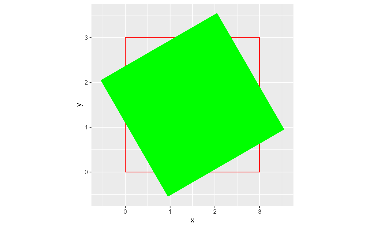
rotator will mathematically “rotate” existing data
points in a data frame:
#| fig.alt: >
#|   ggplot plot showing a bright green square rotated
#|   approximately 120 degrees, positioned over a red
#|   outlined square on a coordinate grid with x and y axes
#|   labeled, set against a light gray background, the
#|   default ggplot2 plot theme.


# Load in your libraries#
library(ggplot2)
library(artpack)

# Make a square yourself if you want#
original_square <-
  data.frame(
  x = c(0, 3, 3, 0, 0),
  y = c(0, 0, 3, 3, 0)
)

# Rotate your data points by 120° and...
# ...anchor the rotation around the center of the square#
rotated_square <-
  rotator(
  data = original_square,
  x = x,
  y = y,
  angle = 120,
  anchor = "center"
)

# Plot the original and rotated squares to see the difference#
ggplot() +
  geom_path(
    data = original_square,
    aes(x, y),
    color = "red"
  ) +
  geom_polygon(
    data = rotated_square,
    aes(x, y),
    fill = "green"
  ) +
  coord_equal()
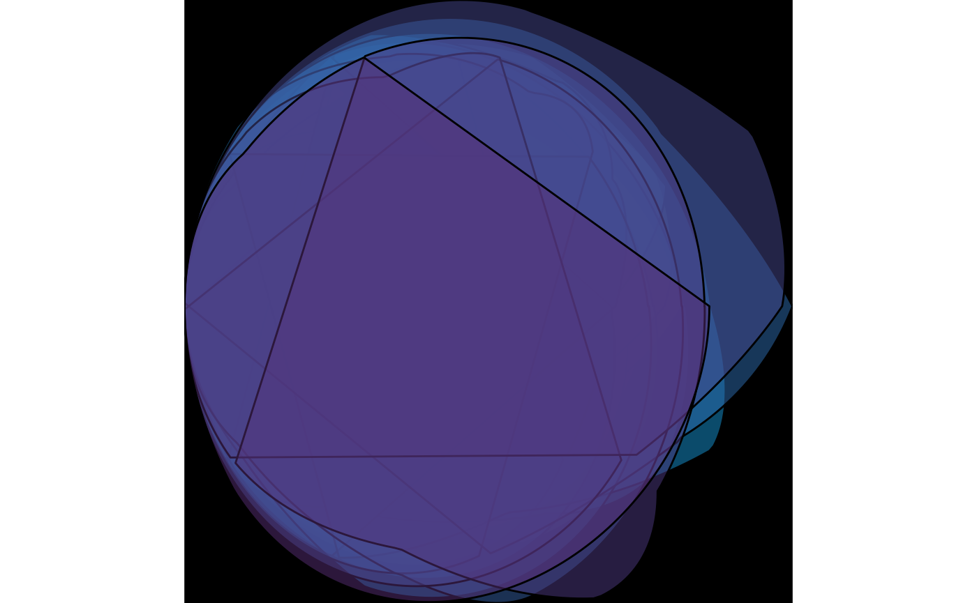
artpack functions are designed to be used in any part of your workflow. Experiment for some cool results:
#| fig-alt: >
#|   Abstract digital visualization featuring flowing, wave-like forms against a black background.
#|   The central element is a smooth, undulating ribbon that transitions through a vibrant spectrum
#|   of colors from magenta/pink on the left, flowing through orange, yellow, green, cyan, and blue
#|   to deep purple on the right. The form has a three-dimensional quality with fine vertical lines
#|   that give it texture and depth, creating the appearance of a dynamic, flowing data visualization
#|   or sound wave.

# Load in your libraries#
library(ggplot2)
library(purrr)
library(dplyr)
#>
#> Attaching package: 'dplyr'
#> The following objects are masked from 'package:stats':
#>
#>     filter, lag
#> The following objects are masked from 'package:base':
#>
#>     intersect, setdiff, setequal, union
library(tibble)
library(artpack)

# Create a base square with artpack if you want#
square <- square_data(x = 0, y = 0, size = .1, group_var = TRUE)

# Create square specs to be iterated on#
n_square <- 500
scaler <- seq(1, 100, length = n_square)
fills <- art_pals("imagination", n = n_square)
angles <- seq(0, 360, length = n_square)
group_n <- group_numbers(1:n_square)

# Add a random transformation for a little razzle dazzle ✨
theta <- seq(0, 30, length = 250)

# Create your list of specs to be iterated on#
list_opts <-
  list(
    scaler,
    fills,
    angles,
    group_n
  )

# Create the final data frame#
df <-
  pmap(list_opts, ~ rotator(
    square |>
      mutate(
        x = (x + ..1),
        y = (y * ..1),
        fill = ..2,
        group = paste0(group, ..4)
      ),
    x = x, y = y, angle = ..3
  )
  ) |>
  list_rbind() |>
  mutate(
    x = x + cos(theta),
    y = y + sin(theta)
  )

# Plot the final image#
df |>
  ggplot(aes(x = x, y = y, group = group)) +
  theme_void() +
  theme(plot.background = element_rect(fill = "#000000")) +
  geom_path(
    color = df$fill,
    alpha = .2
) 
