
Collages and Patterns
Making art in R
R-Ladies Philly
October 12th 2022 | 2022-10-12
About Me
About Me
- I’m Meghan Harris 👋🏾
- Data Scientist 💻
- Prostate Cancer Clinical Trials Consortium (PCCTC) - Memorial Sloan Kettering ⚛️
- thetidytrekker.com 🌐
- @meghansharris
![]()
- meghan-harris
![]()
- I like making generative aRt in R (Rtistry) 🎨 - That’s why we’re here!

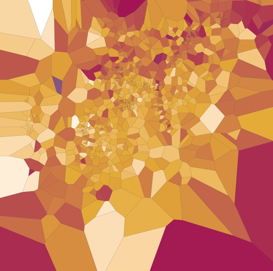
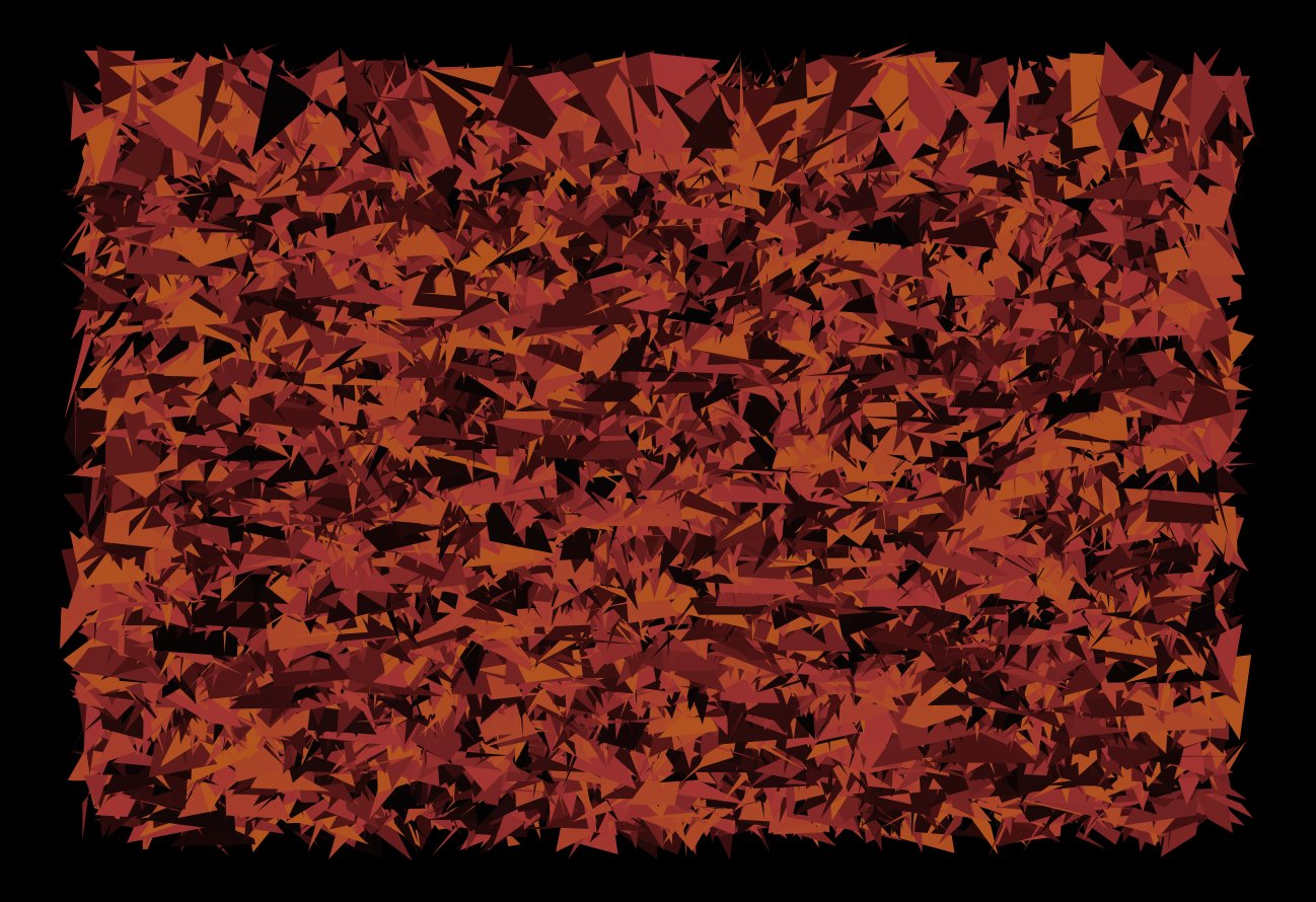
Generative/Random Art Examples
What is Rtistry?
These pieces can be generated randomly…
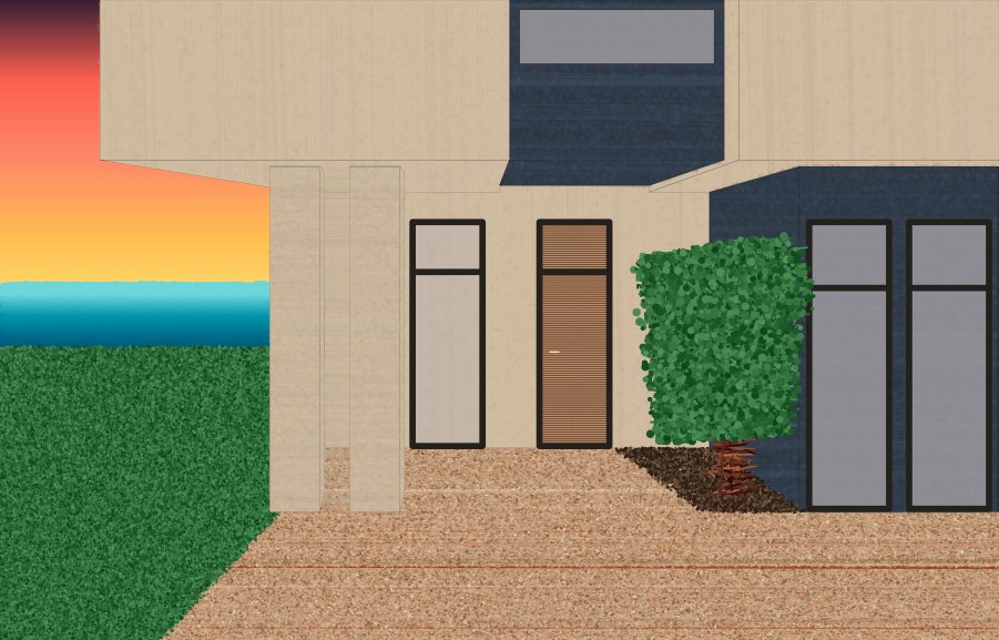
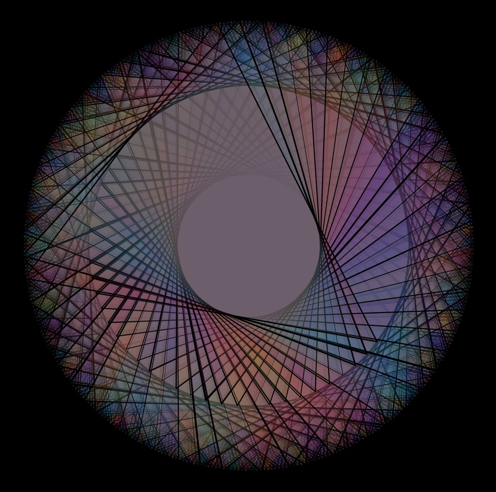
Calculated/Manual Examples
What is Rtistry?
…or intentionally calculated
What is the Point of Rtistry?
What’s the Point of Rtistry?

Don’t be So Serious…Relax
What’s the Point of Rtistry?

Your Tools Can Vary
Minding Your Toolbox
Just like some preparation and tools may be needed to make physical pieces of art like oil paintings and watercolors, those wanting to make rtistry might need to make some decisions about what tools to use as well.

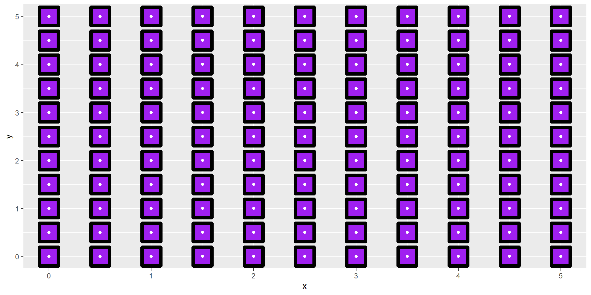
Tool Inspiration - Geoms
Minding Your Toolbox
- Paintbrushes, Pens, etc. AKA Geoms
# Library Load-in===
library(ggplot2)

#Generate a grid===
points <- data.frame(x = seq(0,5, by = .5),
                     y = seq(0,5, by = .5))

grid_points <- expand.grid(points)

#Create the ggplot===
grid_points |>
  ggplot(aes(x,y))+
  geom_point(shape = 22,
             color = "black",
             fill = "purple",
             size = 10,
             stroke = 3)+
  geom_point(color = "white")
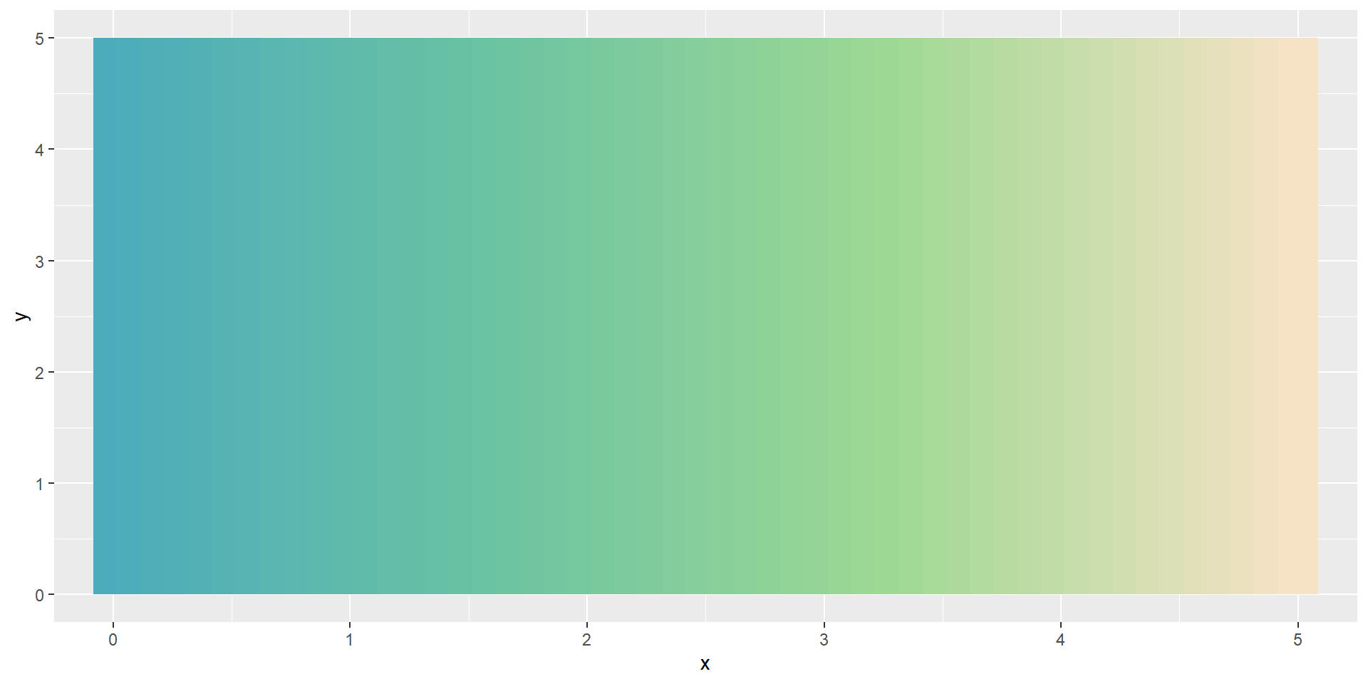
# Library Load-in===
library(ggplot2)

#Calculate data for lines===
vert_lines <- data.frame(x = seq(0,5, by = .1),
                         xend = seq(0,5, by = .1),
                         y = 0,
                         yend = 5)

pretty_colors <- c("#4CACBC", "#6CC4A1", "#A0D995", "#F6E3C5")

pretty_pal <- colorRampPalette(pretty_colors)(nrow(vert_lines))

#Create the ggplot===
vert_lines |>
  ggplot(aes(x,y, xend = xend, yend = yend))+
  geom_segment(color = pretty_pal, size = 10)
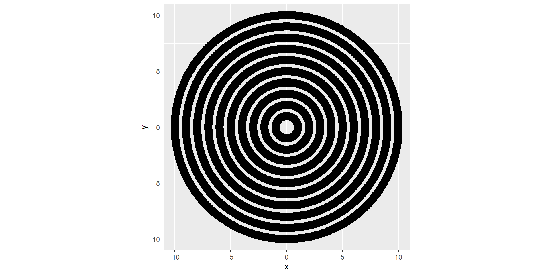
#Library Load-in===
library(ggplot2)
library(dplyr)
library(purrr)

#Generate angles===
angles <- seq(0,2*pi, length.out = 1000)

#Make a starter circle===
circle <- data.frame(x = cos(angles),
                     y = sin(angles))

#Set how many circles/iterations we want
iterations <- 1:10

#Make the final data set===
spirals <- map_df(iterations, ~circle %>%
                                 mutate(x = x*.x,
                                        y = y*.x,
                                        group = .x))

#Create the ggplot===
spirals |>
  ggplot(aes(x,y, group = group))+
  geom_path(size = 5)+
  coord_equal()
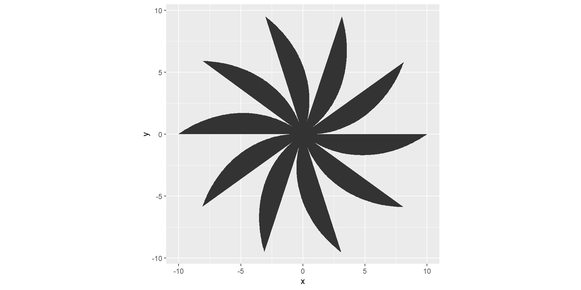
# Library Load-in===
library(ggplot2)

#Angle generation===
angle <- seq(0, 2*pi, length.out = 1000)

#Petal Length===
petal_length <- seq(1,10, length.out = 100)

#Dataframe for ggplot===
flower <- data.frame(x = cos(angle)*petal_length,
                     y = sin(angle)*petal_length)

#Create the ggplot===
flower |>
  ggplot(aes(x,y))+
  geom_polygon()+
  coord_equal()
Making Data for Patterns - What is a pattern?
Making Data for Patterns
What is a Pattern?
Def. (Oxford): A repeated decorative design.
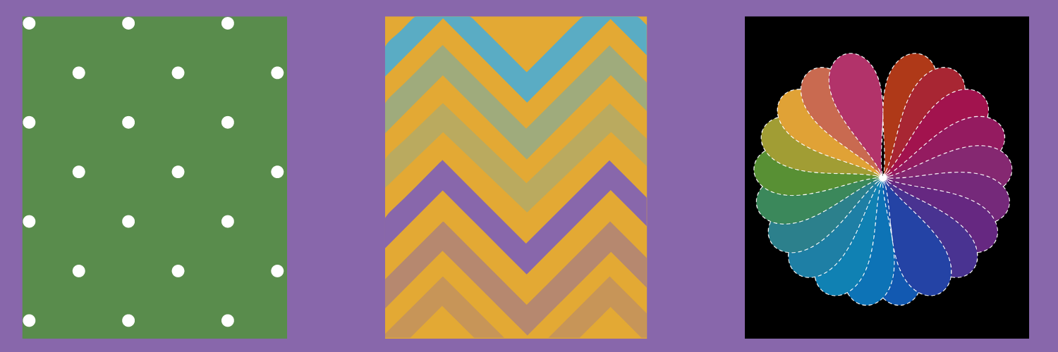
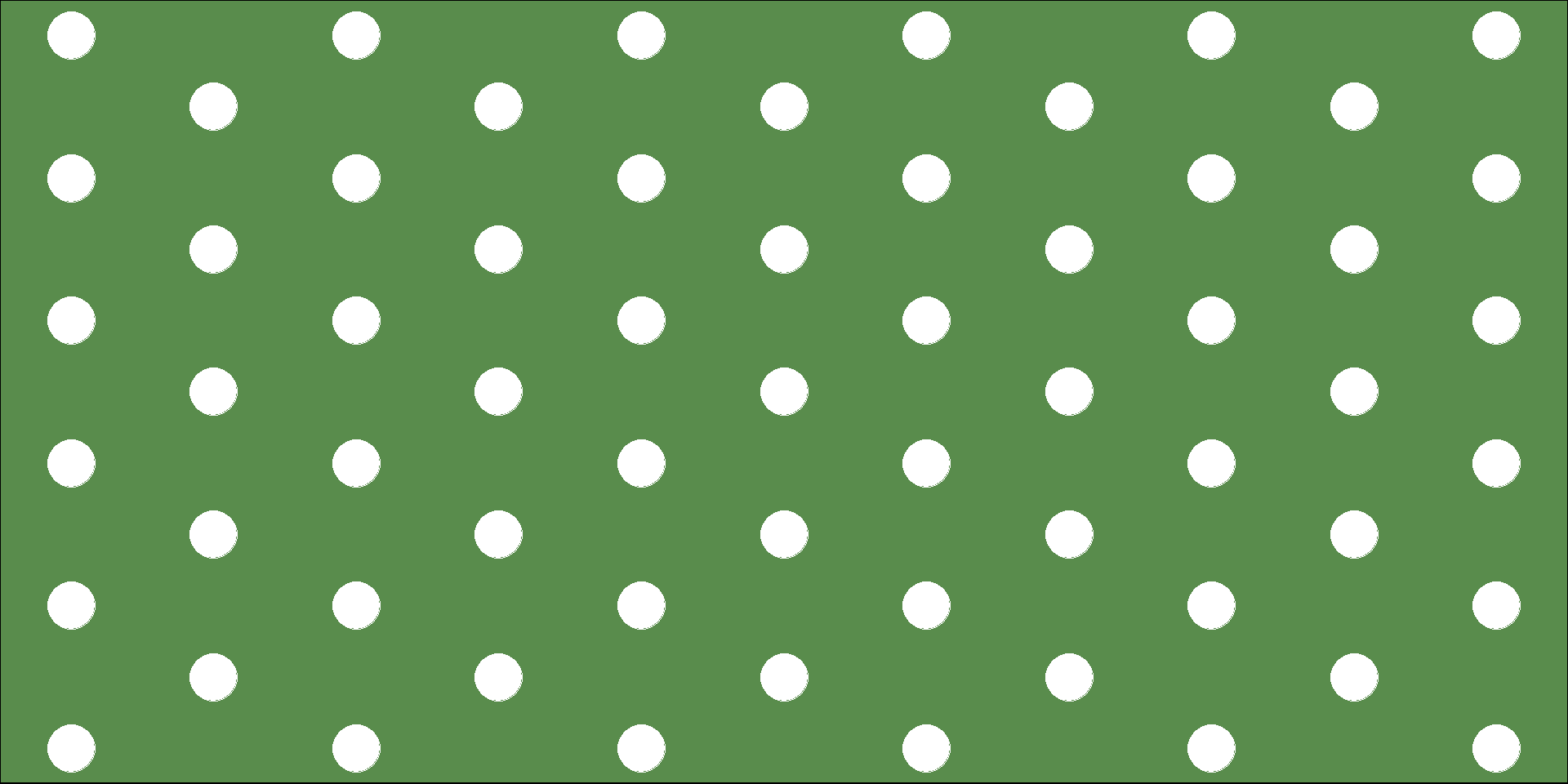
Patterns - Polka Dots Example - First Look
Making Data for Patterns
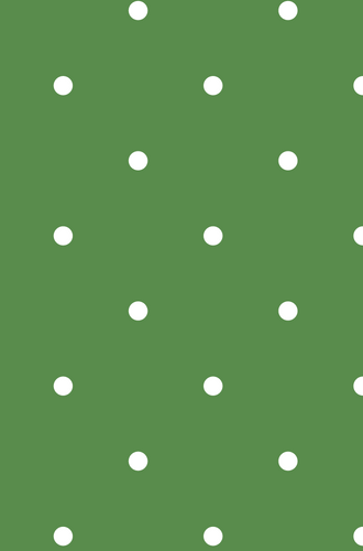
🔎 Observations we can make:
- There’s dots (points)
- There’s an order to how the dots are displayed
- The dots are white
- The background is green ( #598C4C to be exact )
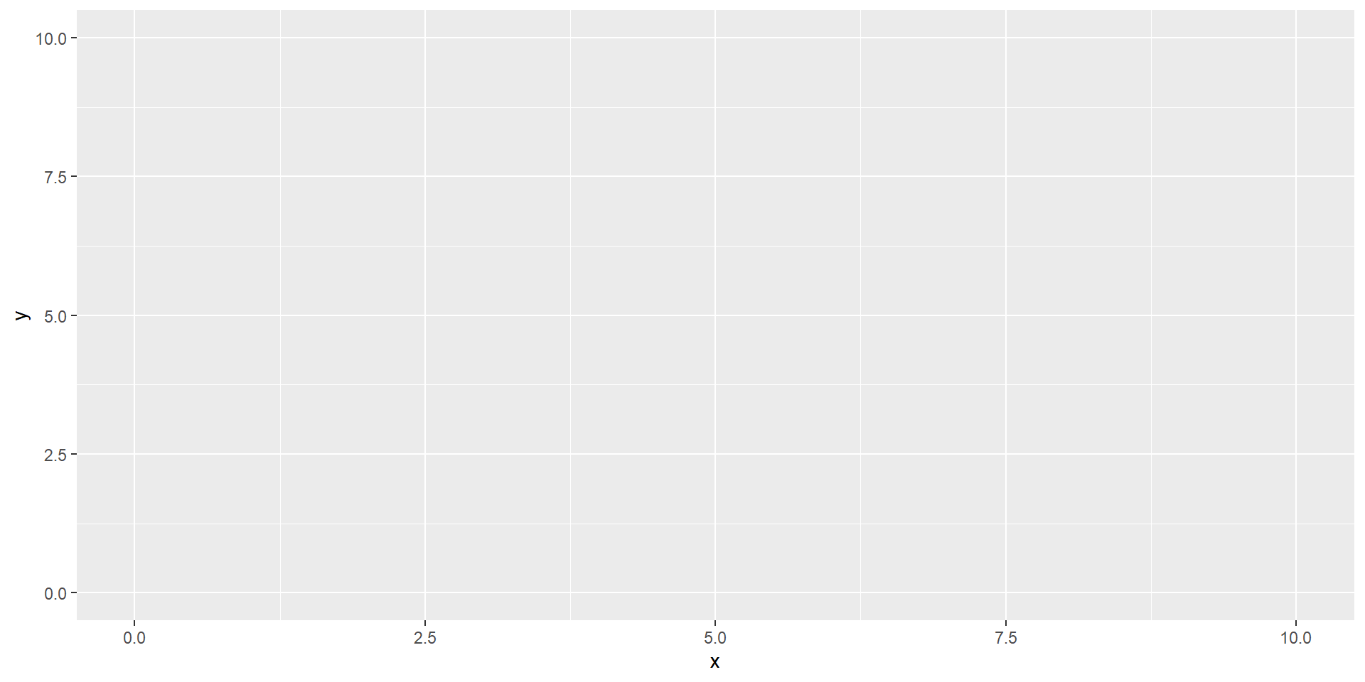
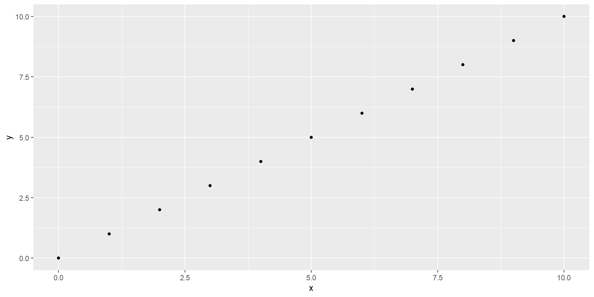
Patterns - Polka Dots Example - Step by Step
Making Data for Patterns
- Libraries and Blank Canvas
- The Goal and The Blank Canvas
- Viewing The Base Data
- Making a Grid
- Spacing Variations
- Tweaking the Aesthetics
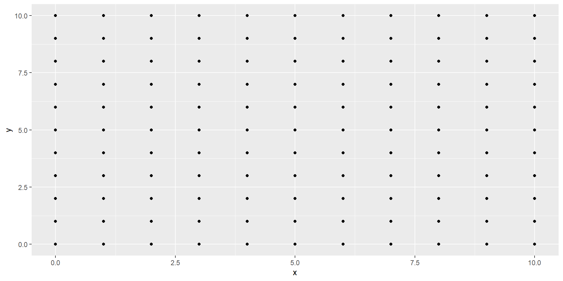
Code:
# "01_patterns_ex.R" in the example_scripts folder#

#Library Load-in#
library(ggplot2) #For making the piece w/ ggplot
library(dplyr) #For data wrangling
library(tibble) #To work with tibbles

#Setting the axes limits for X and Y#
axis_min <- 0
axis_max <- 10

#Creating a "base" data frame to feed into ggplot#
base_data <- tibble(x = axis_min:axis_max,
                    y = x)

#Plotting the "blank" canvas#
base_data |>
  ggplot(aes(x,y))
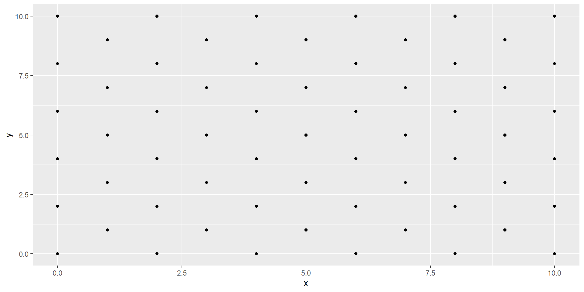
Code:
#2) Add spacing variations#
#Make a new "polka dot" set without the "dropped" values#
polka_dots <- grid_points |>
mutate(x = case_when(y %% 2 == 0 & x %% 2 > 0 ~ NA_integer_,
TRUE ~ x),
y = case_when(x %% 2 == 0 & y %% 2 > 0 ~ NA_integer_,
TRUE ~ y)) |>
filter(if_all(everything(), ~!is.na(.))) #Removes all rows with an NA#
#View the new dataset on the canvas#
polka_dots |>
ggplot(aes(x,y))+
geom_point()
Code:
#3) Add final aesthetic options to make it pretty
#Setting options for the image#
dot_size <- 10
dot_color <- "#ffffff" #"white" works too
background_color <- "#598C4C"
#Plotting the final image - while feeding in the options#
polka_dots |>
ggplot(aes(x,y))+
theme_void()+ #Removes axes, labels, etc.
geom_point(size = dot_size,
color = dot_color)+
theme(plot.background = element_rect(fill = background_color))
Patterns - Chevron Example - First Look
Making Data for Patterns
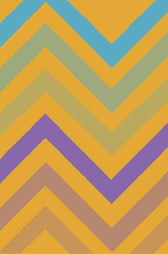
🔎 Observations we can make:
- There’s wide, “zig-zagged” lines (paths)
- It’s the same line but copied and “shifted up” the plot
- There’s six lines with six distinct colors ( #c89658, #b6886f, #8867ab, #bbaa5f, #9fab7c, and #5aabc4 )
- The background is yellow ( #E3A934 to be exact )
Patterns - Chevron Example - Step by Step
Making Data for Patterns
- Libraries and Base Data
- The Goal and The Base Data
- “Bumping” Up the Points
- Iterating Up the Plot
- Grouping is Key
- Tweaking the Aesthetics
Code:
# "02_patterns_ex.R" in the example_scripts folder#
#Library Load-in#
#library(ggplot2) #For making the piece w/ ggplot
#library(dplyr) #For data wrangling
#library(tibble) #To work with tibbles
library(purrr) #For iteration work
#Setting the axes limits for X and Y#
axis_min <- 0
axis_max <- 10
#Creating a "base" data frame#
base_data <- tibble(x = axis_min:axis_max,
y = axis_min) #this is a straight horizontal line
#Plotting the base_data canvas#
base_data |>
  ggplot(aes(x,y))+
geom_point()+
geom_path()
![]()
![]()
Code:
#2) Copy and Paste the same line up the plot#

#Setting up the number of iterations and "shifts" up the plot#
n <- 1:6

#Creating a new dataframe with "copied and shifted" lines#
#n value is added to each y value 6 times#
zigzags <- map_df(n, ~ zigs |>
                        mutate(y = y + .x))

#Viewing the zigzags frame#
zigzags |>
  ggplot(aes(x,y))+
  geom_path()
![]()
Code:
#2) Copy and Paste the same line up the plot#

#Setting up the number of iterations and "shifts" up the plot#
n <- 1:6

#Creating a new dataframe with "copied and shifted" lines#
#n value is added to each y value 6 times#
#group value create a string to keep each "line" together#
zigzags <- map_df(n, ~ zigs |>
                        mutate(y = y + .x,
                               group = paste0("line",.x)))

#Viewing the zigzags frame#
zigzags |>
  ggplot(aes(x,y, group = group))+
  geom_path()
![]()
Code:
#3) Add final aesthetic options to make it pretty

#Setting options for the image#
line_size <- 10
line_colors <- c("#c89658", "#b6886f", "#8867ab",
                 "#bbaa5f", "#9fab7c", "#5aabc4")
background_color <- "#E3A934"

#Re-do the iterations - map colors into the dataset - it's easier#
zigzag_colored <- map2_df(n, line_colors, ~ zigs |>
                                             mutate(y = y + .x,
                                                    group = paste0("line",.x),
                                                    color = .y))

#Plotting the final image - while feeding in the options#
zigzag_colored |>
  ggplot(aes(x,y, group = group))+
  theme_void()+ #Removes axes, labels, etc.
  geom_path(size = line_size,
            lineend = "square",
            linejoin = "mitre",
            color = zigzag_colored$color)+
  theme(plot.background = element_rect(fill = background_color))
![]()
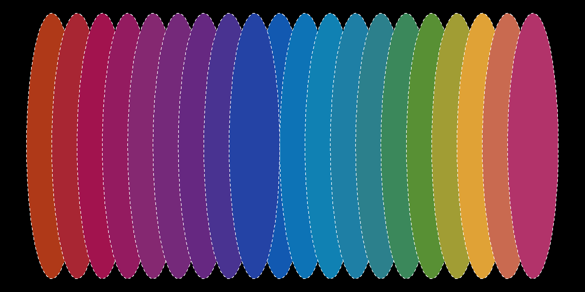
Patterns - Rainbow Wheel Example - First Look
Making Data for Patterns
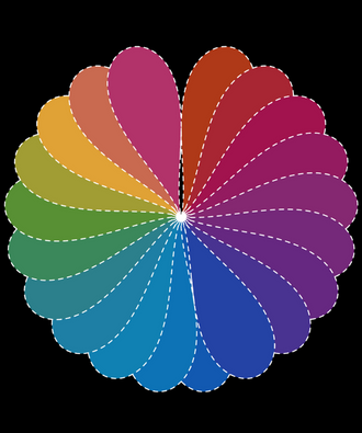
🔎 Observations we can make:
- This looks fancy, but we can use some illusions to make this
- It’s really just one circle, just copied 20 times
- There’s twenty distinct colors on a rainbow spectrum
- Each circle has a white, dashed border around it
- The background is black
Patterns - Rainbow Wheel Example - Step by Step
Making Data for Patterns
- More Complicated Base Data
- The Goal and The Base Data
- Iterating the Data Set
- Tweak the Aesthetics
- Finesse the ggplot
Code:
# "03_patterns_ex.R" in the example_scripts folder#
#Library Load-in#
#library(ggplot2) #For making the piece w/ ggplot
#library(dplyr) #For data wrangling
#library(tibble) #To work with tibbles
#library(purrr) #For iteration work
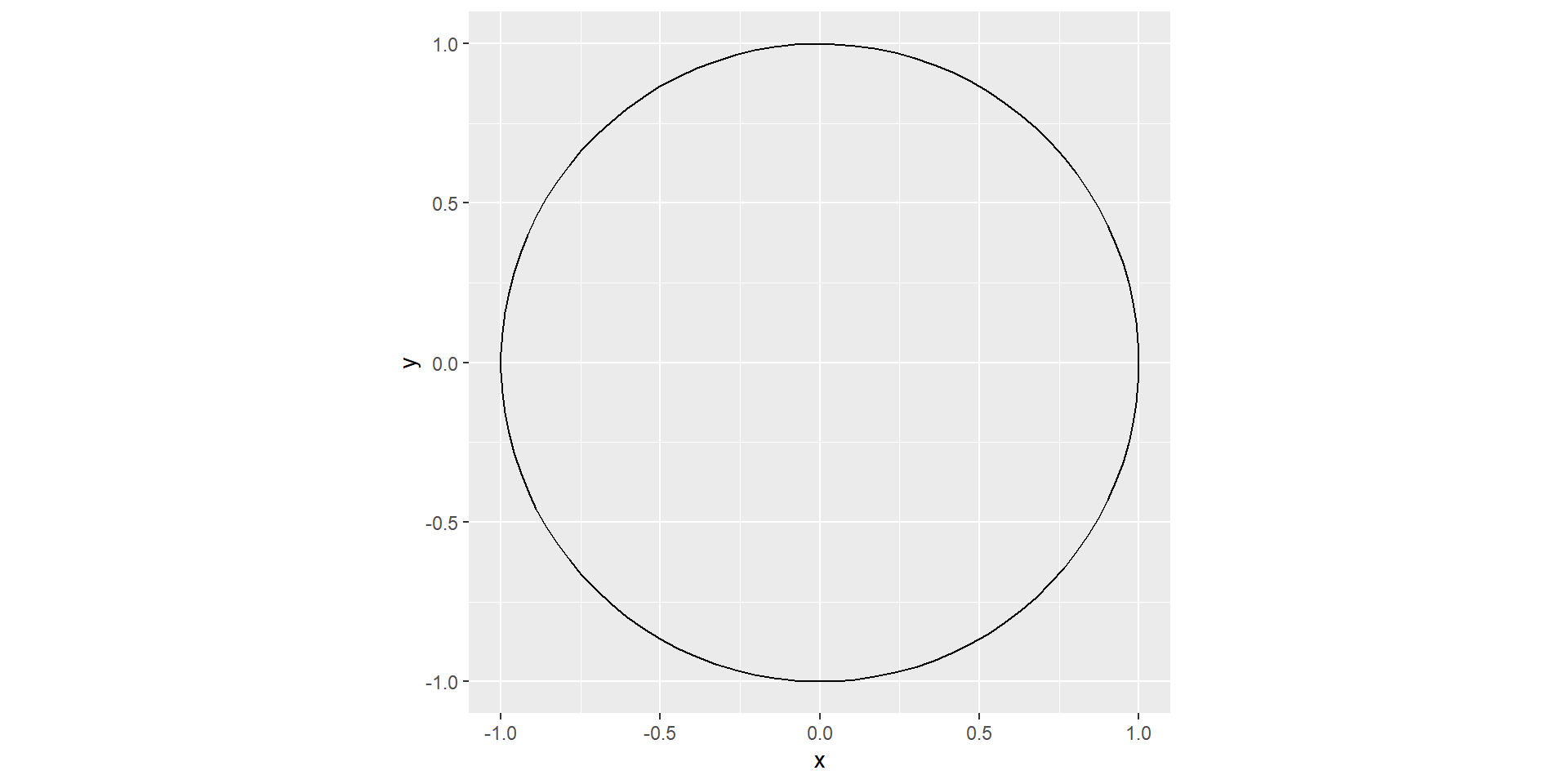
#1) Calculate data for a circle from scratch#
#Make a vector with angles for the circle#
angles <- seq(0, 2*pi, length.out = 100)
#Make the full circle with "converted" equations#
circle <- tibble(x = cos(angles),
y = sin(angles))
#View the base_circle plot#
circle |>
ggplot(aes(x,y))+
geom_path()+
coord_equal()
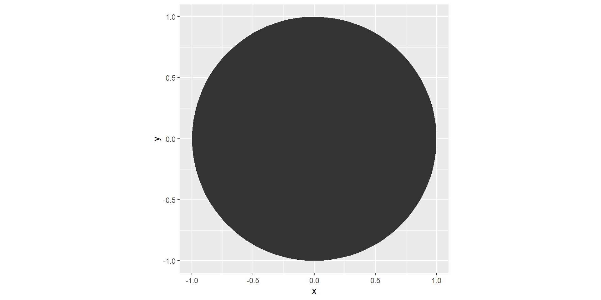
Code:
#2) Iterate the circle to copy and shift in a row#

#Number of circles we want in total#
n = 20

#Setting up the spectrum of colors we want to use#
rainbow_pal <-  c("#af3918", "#a21152", "#822b75",
                  "#612884","#154baf","#0b82b9",
                  "#277e9d", "#488e35","#e3a934","#b2336a")

#Expanding this spectrum to match the number of circles we want#
final_pal <- colorRampPalette(rainbow_pal)(n)

#Creating a data frame with circles, colors, and group variables#
circle_row <- map2_df(1:n,final_pal, ~circle |>
                       mutate(x = x + .x,
                              color = .y,
                              group = paste0("group",.x)))

#View the data as-is#
circle_row |>
  ggplot(aes(x,y, group = group))+
  geom_polygon()
Code:
#3) Add final aesthetic options to make it pretty

#Setting options for the image#
line_style <- 2
line_color <- "#ffffff"
background_color <- "#000000"

#Plotting the final image while feeding in options#
#Fill variable gets the colors from the dataset#
circle_row |>
  ggplot(aes(x,y, group = group))+
  theme_void()+
  geom_polygon(fill = circle_row$color,
               color = line_color,
               linetype = line_style)+
  theme(plot.background = element_rect(fill = background_color))
Code:
#3) Add final aesthetic options to make it pretty#

#Setting options for the image#
line_style <- 2
line_color <- "#ffffff"
background_color <- "#000000"

#Plotting the final image while feeding in options#
#Fill variable gets the colors from the dataset#
circle_row |>
  ggplot(aes(x,y, group = group))+
  theme_void()+
  geom_polygon(fill = circle_row$color, color = line_color, linetype = line_style)+
  theme(plot.background = element_rect(fill = background_color))+
  coord_polar() #warps the circles into a "wheel"
Making Data for Collages - What is a Collage?
Making Data for Collages
What is a Collage?
Def. (Oxford): a piece of art made by sticking various different materials on to a backing.
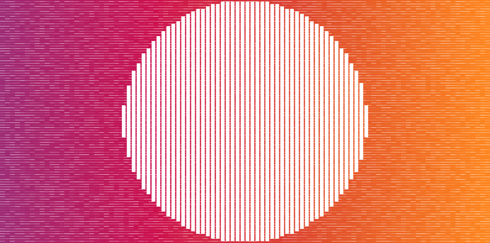
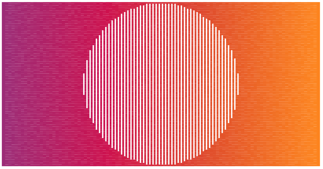
Making Data for Collages - Sunset Example - A Closer Look
Making Data for Collages
Patterns - Sunset Example - Observations
Making Data for Patterns
🔎 Observations we can make:
- The image is landscape, (the max X limit is larger than the max Y limit.)
- Background is a gradient of colors
- A pattern of white lines varying in size is on top of the gradient
- There’s a white circle in the middle that’s made up of thick solid white lines
Collages - Sunset Example - Step by Step
Making Data for Collages
- Base Plot
- The Goal and The Base Plot
- Creating a Gradient
- Creating an Overlay Pattern
- Creating a Fancy Circle
- Layering Everything Together
Code:
# "04_collage_ex.R" in the example_scripts folder#

#Library Load-in#
#library(ggplot2) #For making the piece w/ ggplot
#library(dplyr) #For data wrangling
#library(tibble) #To work with tibbles
library(sp) #For doing more complicated polygon work

#1) Set up our ggplot to be landscape#

#X limits#
xmin <- 0
xmax <- 20

#Y limits#
ymin <- 0
ymax <- 10

#Creating the base_data#
base_data <- tibble(x = seq(xmin,xmax, length.out = 100),
                    y = seq(ymin,ymax, length.out = 100))

#Viewing the plot#
base_data |>
  ggplot(aes(x,y))

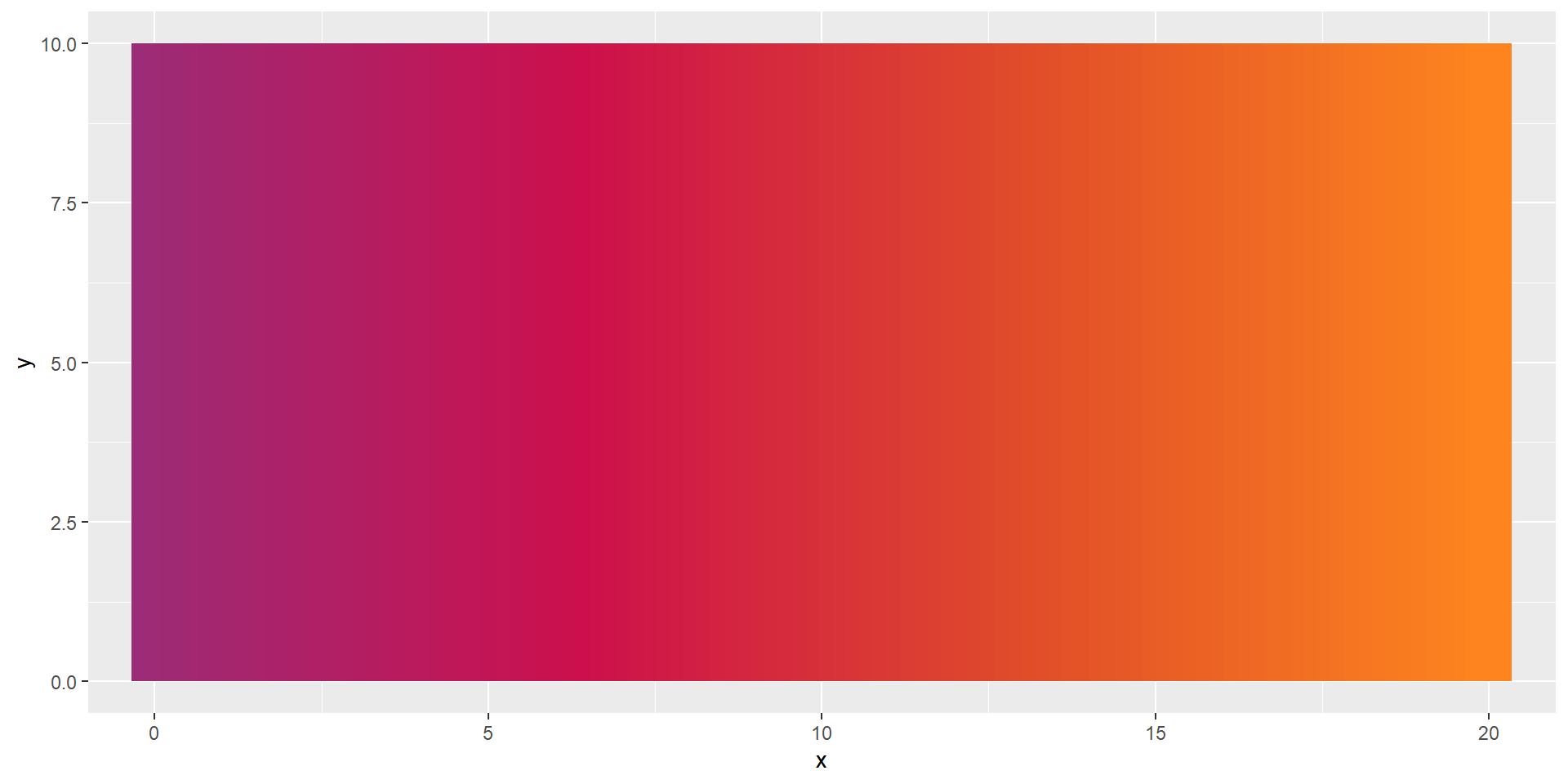
Code:
#2) Set up a color palette and data for geom_segment()#

#Data frame with background segment lines#
back_segments <- tibble(x = seq(xmin, xmax, length.out = 100),
                 xend = x, #x == xend for vertical lines#
                 y = ymin,
                 yend = ymax)

#Create a color palette to fit the data frame (100 rows)#
color_pal <- c("#9C2C77", "#CD104D", "#E14D2A", "#FD841F")
segment_colors <- colorRampPalette(color_pal)(nrow(back_segments))

#View the plot while feeding in color palette and tweaking size#
back_segments |>
  ggplot(aes(x,y, xend = xend, yend = yend))+
  geom_segment(color = segment_colors, size = 10)
Code:
#3) Expand the base data with expand.grid() to create a pattern#
#Create a new expanded data frame off of base_data#
overlay <- expand.grid(base_data)

#Overlay Options#
#Set the color for the overlay pattern
overlay_color <- "#ffffff"

#Create varying sizes for the overlay to fill the data#
overlay_sizes <- sample(seq(.01, .2, length.out = nrow(overlay)))


#Layer the overlay data frame onto the back_segments#
back_segments |>
  ggplot(aes(x,y,
             xend = xend,
             yend = yend))+
  theme_void()+
  geom_segment(color = segment_colors,
               size = 10)+
  geom_path(data = overlay,
            aes(x,y, group = y),
            color = overlay_color,
            size = overlay_sizes,
            inherit.aes = FALSE)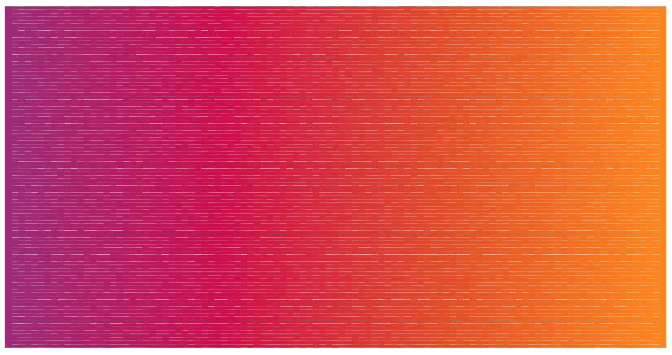
Code:
#4) Create a circle in the middle of the image from scratch#

#Setting the angles#
angles <- seq(0,2*pi, length.out = 100)

#Storing in a dataframe for reference#
ref_circle <- tibble(x = cos(angles) * (ymax/2) + (xmax/2) ,
                     y = sin(angles) * (ymax/2) + (ymax/2))

#Detecting points that only fit inside the circle#
#Basing off overlay data because it's already created#
fancy_circle <- overlay |>
  mutate(logic = point.in.polygon(x,y, circle$x, circle$y)) |>
  filter(logic == 1)

#Setting fancy circle options#
circle_width <- 2
circle_color <- "#ffffff"

#Setting options for the image#
line_style <- 2
line_color <- "#ffffff"
background_color <- "#000000"

#Layer the fancy circle data onto the existing plot#
back_segments |>
  ggplot(aes(x,y, xend = xend, yend = yend))+
  theme_void()+
  geom_segment(color = segment_colors, size = 10)+
  geom_path(data = overlay, aes(x,y, group = y),
            color = overlay_color,
            size = overlay_sizes,
            inherit.aes = FALSE) +
  geom_path(data = fancy_circle,
            aes(x,y, group = x),
            color = circle_color,
            size = 2,
            lineend = "butt",
            inherit.aes = FALSE)
Code:
#This can be layered differently to reduce code#
#geom order from top to bottom determines display order#

overlay |>
  ggplot(aes(x,y))+
  theme_void()+
  geom_segment(data = back_segments,
               aes(x,y, xend = xend, yend = yend),
               color = segment_colors,
               size = 10,
               inherit.aes = FALSE)+
  geom_path(aes(x,y, group = y),
            color = overlay_color,
            size = overlay_sizes) +
  geom_path(data = fancy_circle,
            aes(x,y, group = x),
            color = circle_color,
            size = 2,
            lineend = "butt")+
  coord_equal(expand = FALSE)